Interactive Infographic for the Toronto Transit Commission:
How To Navigate the TTC Subway
This project is a three-week study with multiple research methods, analysis, and design.
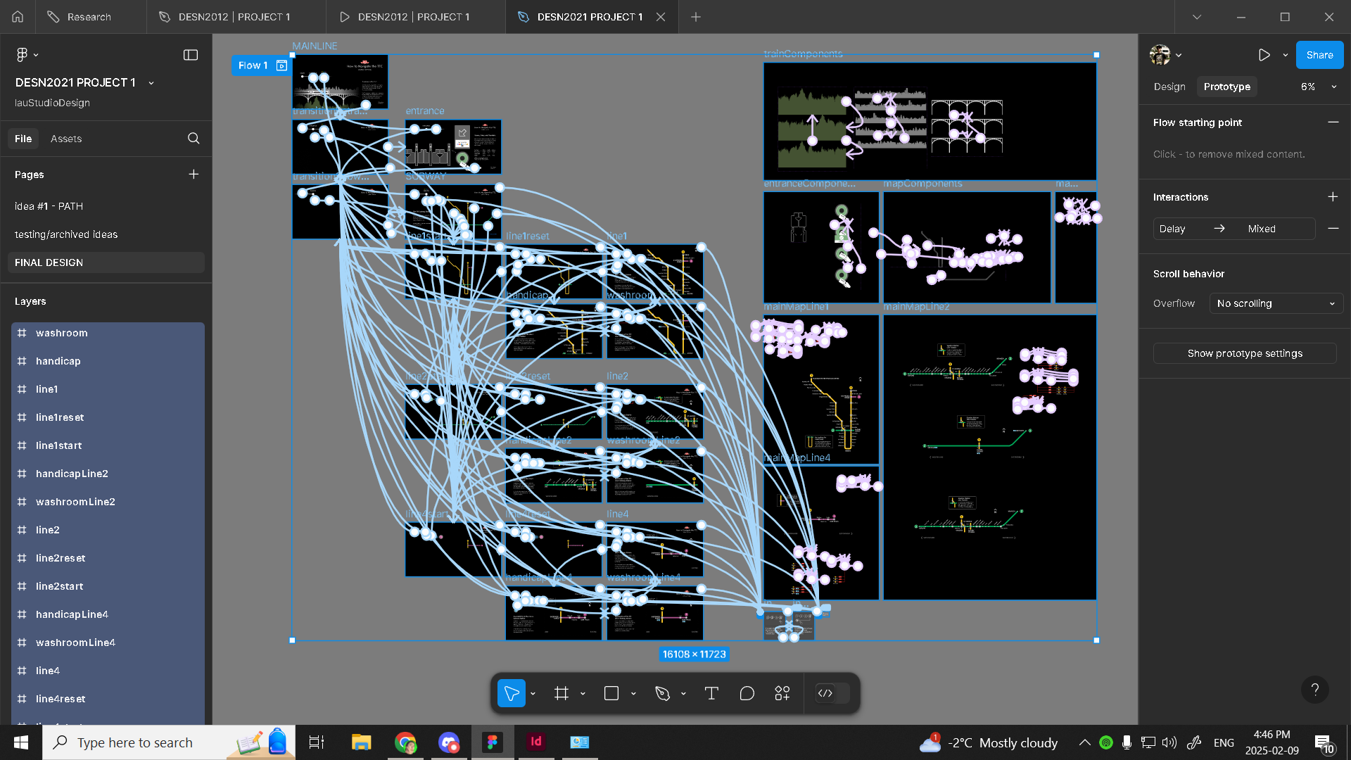
Prototype Mapping
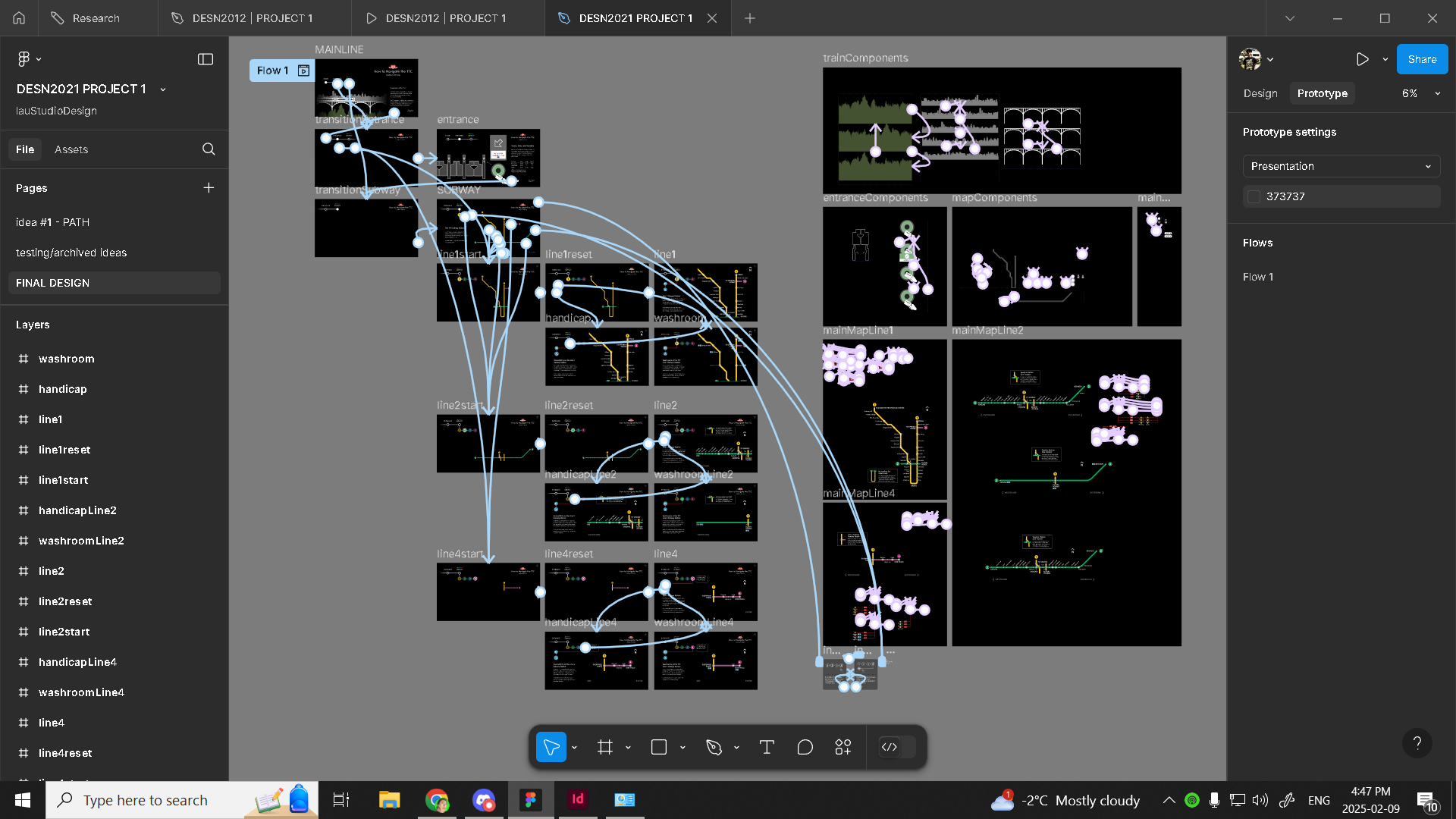
User Flow
Full website preview; video format
Ideation:
This interactive infographic had to find a way to implement a simplistic user experience that appeals to the general public of the GTA. Some considerations I had for potential users would be; Accessibility, Language Barriers, Limited Understanding of Modern Technology, and daily users.
How do I appeal to all of these audiences?
With the earlier collection of data/research, I simplified complex routes and systems to the most essential ones while designing a way to show the differences in accessibility/amenities for these routes.
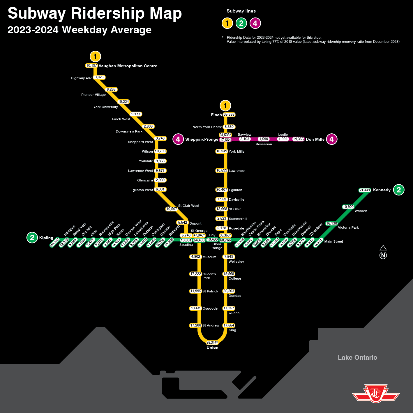
TTC Subway Ridership Map
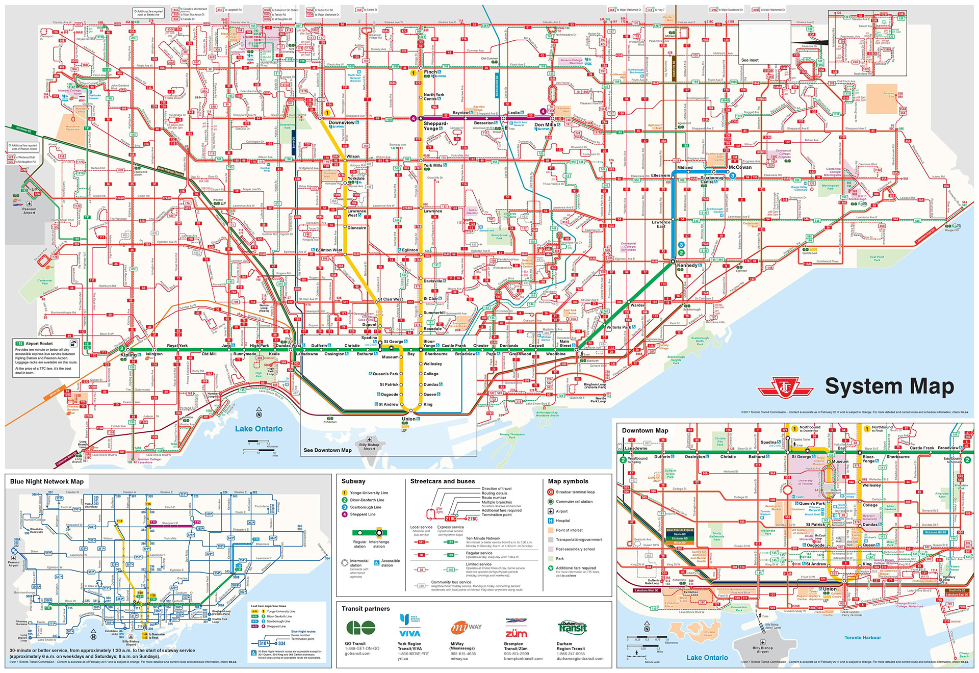
TTC System Map
Typeface Choices:
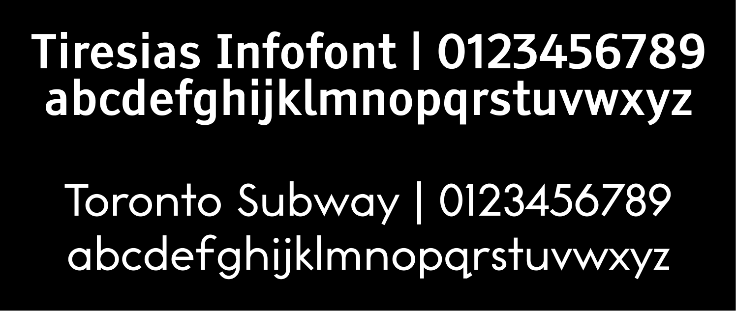
The typefaces I used were Tiresias Infofont and Toronto Subway.
Toronto Subway is the official font for the TTC, it is a geometric sans-serif typeface. I used this font because I wanted to brand this similarly to the TTC. I am designing this from the perspective that this would be on a TTC website or station screen.
Tiresias Infofont is a highly legible font, it was designed for the best legibility by people with impaired vision at the Scientific Research Unit of the Royal National Institute of the Blind in London. As I want to be as accessible as possible, I used this font as an alternative to the basic Helvetica typeface.
Main Typefaces
Ideation:
The introduction to this infographic establishes the idea that the TTC Subway uses trains for its transportation, as indicated by the motion graphic.
Page navigation has two ways of advancement. One way is the conventional button, in the bottom right. The other way is more on the theme, following the idea of subway lines. In the top left, you will see text indicators as well as hover interaction on these circles. To add familiarity, this is similar to
a timeline.
a timeline.
By having a lack of information on the home page, users do not feel like they need to absorb any information until they are ready to move on/start by entering the next page.

Home Page
This motion graphic diagram removes language barriers or learning barriers by providing a visual step-by-step repeating process for gaining access to the subway stations.
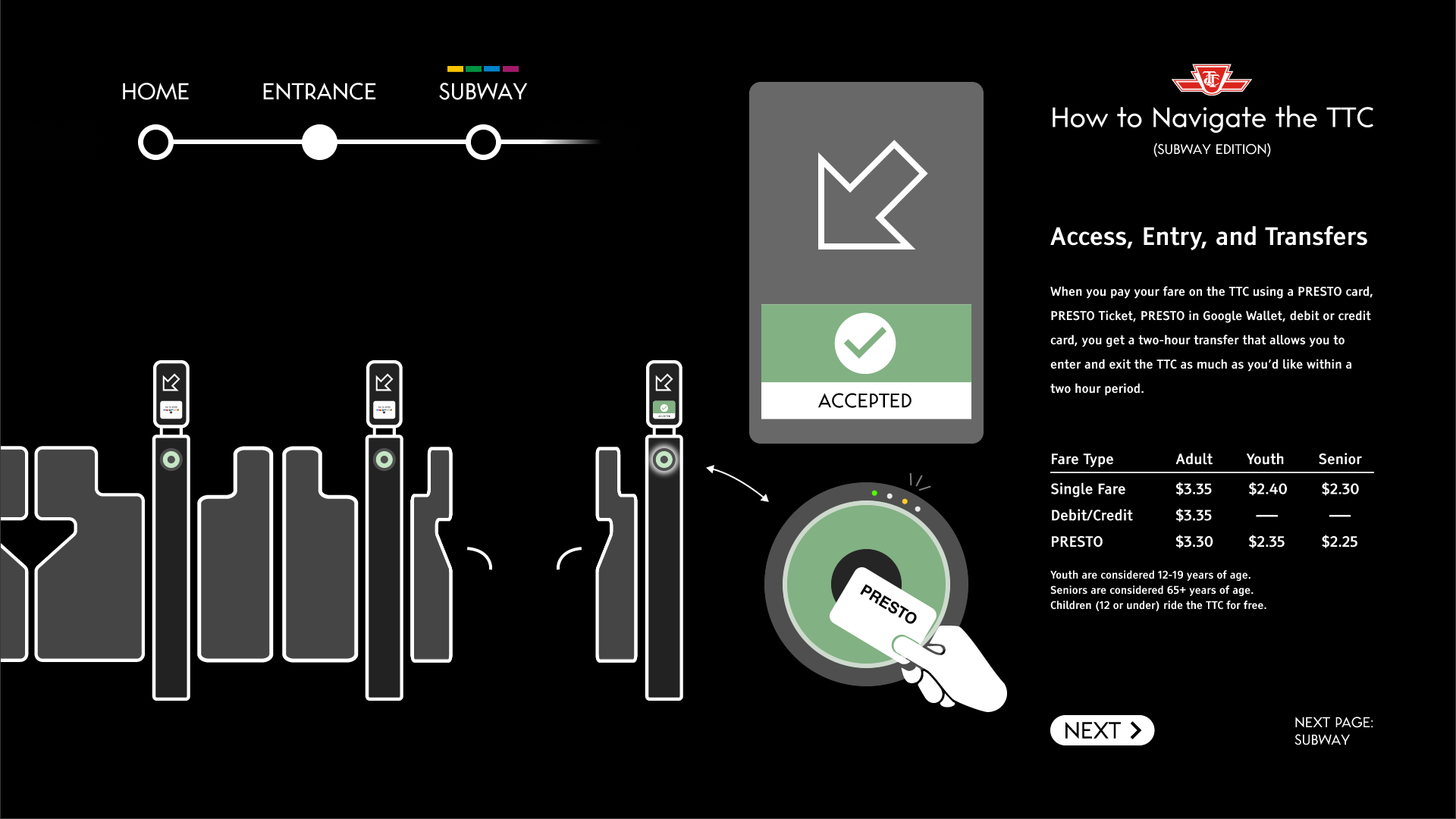
Entrance Page
Following the timeline/subway line idea in-page navigation, users can now click on the respective line icons or on the lines themselves. All of which have corresponding hover/glow animations. Hovering the icon will also make the line glow. In case the user needs more assistance in navigating this page, there is a help button at the top right.
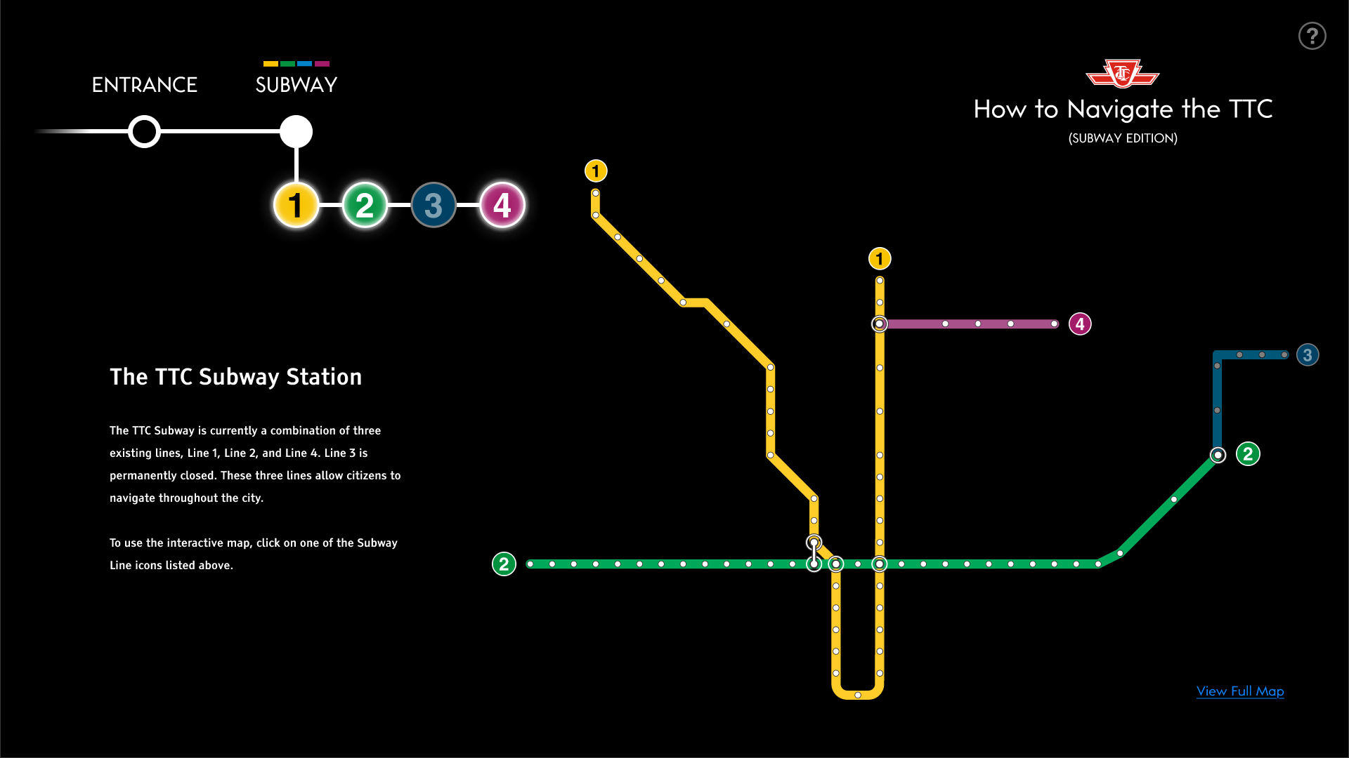
Subway Navigation Page
I’ve separated the lines to allow for more detailed focused routes and station details as I did not want to overload the user with information.
To appeal to the general public, I used the research of the most popular stations and existing bus routes to transfer between the west and east sides of the line to create an interactive feature which shows the most essential routes.
This information is simplified from the complex TTC bus route map and charts of station usage.
The border of the map fading and the map exiting the frame indicates its scrollability.

Line 1 Sub Page
To avoid language barriers, I’ve used symbols in the navigation between lines and subpages. These universal symbols of accessibility and amenities remove the need for type.
On the amenities page, I removed the stations without such services to display the differences and contrasts in the subway line. I use symbols here because, with the number of stations, the map is less cluttered and allows for such a design. It also differentiates between transfer stations (grayed out) and shows which stations have those services.
This allows for users to see connected routes towards those stations, while removing unrelated routes, providing a more concise and clear map.
The bus routes show how to get between stations. They are clickable/pinnable.
These maps provide key bus route information on the most popular stations such as Eglinton and Ossington. This provides extra value in case the subway goes down, alternative routes already exist to get between stations.

Line 1 Sub Page | Amenities Filtered